
01
Timber warmth
Warm orange-brown wood panels create a casual, tactile base. The website turns that into section bands and texture instead of copying a generic restaurant palette.
Evidence first. Design second.
No invented founding story, secret recipe, award history, or customer promise. The concept starts with what can actually be seen and verified publicly, then turns those cues into a coherent digital system.
Public visual language
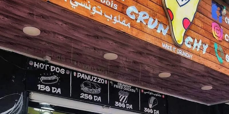
The real storefront is the strongest public brand source located during research.
Warm orange-brown wood panels create a casual, tactile base. The website turns that into section bands and texture instead of copying a generic restaurant palette.
The public sign uses large, imperfect white CRUNCHY lettering. The digital version answers with oversized condensed typography and rough, high-contrast composition.
A playful yellow pizza-slice mascot with red toppings is visible on the storefront. The concept favicon/logo is an original recreation inspired by that language, not an official asset.
Black menu boards beneath the storefront support the dark UI foundation: fast to scan, easy to contrast, and strong enough for bright food/CTA accents.
The slogan appears publicly on the facade and gives the concept a real verbal anchor. It is used prominently because it is supported by visual evidence.
Public listings classify Crunchy as a fast-food restaurant in Mohammadia. The UX therefore prioritizes menu, call, directions, and quick ordering patterns.
Public evidence
The storefront carries enough character to build a real design language without inventing lore. That keeps the concept both distinctive and defensible.
Visible elements include the CRUNCHY name, the “MAKE IT CRUNCHY” line, a bright pizza mascot, wood cladding, black menu panels, and the items Hot Dog, Panuzzo, and Crunchy Fried Chicken.
See evidence vs demo menuTransparency system
Digital opportunity
A production website could preserve the same strong visual identity while connecting verified menu data, real availability, official ordering, loyalty, delivery, and store operations.